Tuesday, 30 April 2013

Research : Other Zines

Lost & Found - Two Zine Package
Travel Diary Zines
lost and found zine
Things I've Lost Zine
The Various Things I Eat Zine
The Various Things I Eat Zine 


9/11 Flipbook
9/11 Flipbook Zine


Just some Zines from Etsy.com. It's just to see how others have made theirs and the variety of subject, sizes and way in which they have been made. It was interesting to see the range. It was also useful to see the prices people listed their zines at. I feel that could be useful for deciding how much ours will be (also factoring prices that have to cover our payments for printing/material etc).

Monday, 29 April 2013

Research : Looking at other exhibiton publications


Just looking at how traditional exhibition publications are laid out and how they use text and images.

Wednesday, 24 April 2013

Inspiraton // Salvador Dali

Salvador Dali was a prominent Spanish surrealist painter. He is often known for his striking and bizarre images in his work. 

 'The Persistence of Memory' (1931) is one of his most famous works. Many of the surrealist elements that are visible within are associated with erotically explicit objects, dreamlike states, hallucinations, and lonliness. Much of this is created through Dali's precision in rendering unidentifiable objects and his use of space and light, often creating deep and receding spaces with unknown light sources. 

Symbolism was explored thoroughly throughout his work. For example, the meting watch is said to suggests Einstein's theory that time is relative and not fixed.Equally, animals reocurr within his work, ants suggest death, deay and immense sexual desire; elephants are to distort space and locusts symbolise waste and fear.

"I am painting pictures which make me die for joy, I am creating with an absolute naturalness, without the slightest aesthetic concern, I am making things that inspire me with a profound emotion and I am trying to paint them honestly." Salvador Dalí, in Dawn Ades, Dalí and Surrealism.


Salvador Dalí, La Conquête de l'irrationnel (Paris: Éditions surréalistes, 1935)

Monday, 22 April 2013

Inspiration // Dadism

Dadaism was a movement that involved art and literature and concerned itself with anti-war politics via methods of 'anti-art', the antithesis of art. It ignored aesthetics and intended to offend. Dadaism blamed the reason and logic of bourgeois capitalist society that had led to war. As a result, their work often expressed the idea of rejection of logic and embrace chaos and irrationality.

Dada often used public gathering, demonstrations and publishing art/literary journals with passionate coverage of art, politics and culture. Dadism later influenced the avant-garde, surrealism and pop art.


Marcel Duchamp, 1917, Fountain. Ceramic, glazed ceramic,
61 cm x 36 cm x 48 cm,
Tate Modern

"Dada is the groundwork to abstract art and sound poetry, a starting point for performance art, a prelude to postmodernism, an influence on pop art, a celebration of antiart to be later embraced for anarcho-political uses in the 1960s and the movement that lay the foundation for Surrealism"
(Marc Lowenthal, translator's introduction to Francis Picabia's I Am a Beautiful Monster: Poetry, Prose, And Provocation)

Marcel Duchamp, 1919, Mona Lisa parody "LHOOQ". Post card reproduction with added moustache, goatee and title in pencil, 19.7 x 12.4 cm

So how does this fit within our ideas for our zine? Zine's ignore the aesthetics and traditions of normal publishing and magazines; they are low cost, self distributed, no capitalist element etc. Therefore, it could be argued that Zines are almost a Dadaist version of magazines. However, Dadaism comes into our zines as it is seen as a movement that influenced Surrealism, something I am exploring for the design of my pages for the zine and perhaps other pages too.

 Richter, Hans (1965), Dada: Art and Anti-art, Oxford Univ Press
  Marc Lowenthal, translator's introduction to Francis Picabia's I Am a Beautiful Monster: Poetry, Prose, And Provocation

Sunday, 21 April 2013

Inspiration // Surrealism

Surrealism originated in the 1900s, specifically the 1910s and 1920s, as a literary movement experimenting with 'automatism'. This was a mode of expression that sought to release the imagination of the subconscious. It was officially consecrated in Paris in 1924 with the publication of the 'Manifesto of Surrealism' by Andre Breton. This allowed Surrealism to become international intellectual and political force.

As Surrealism began as a literary movement, much of the poetry and prose were influenced by pyschologial theories and dream studies of Sigmund Freud in combination with political ideas of Marxism. Breton and his contemporaries drew upon ideas of the private world of the mind, the part of the mind that is traditionally restricted by reason and societal limitations which creating unexpected imagery. 

Bride Stripped Bare by Her Bachelors, Even (The Large Glass) (1915–23; Philadelphia Museum of Art)
At first, Surrealist poets were reluctant to align themselves with visual artists because they believed that laborious processes of painting, drawing and sculpture were not spontaneous. However, artists such as Giorgio de Chirico, Pablo Picasso, Francis Picabia and Marcel Duchamp were held in high regard for their work was analytical, provocative and erotic. For example, Duchamp's conceptually complex Bride Stripped Bare by Her Bachelors, Even (The Large Glass) was admired by Surrealists and often thought to be a precursor of Surrealism for its bizarrely juxtaposed and erotically charged objects.
Max Ernst, André Masson and Man Ray were of the first artists who aligned themselves with Surrealism. All these artists use curving, continuous lines and forms in which emerge strange figures and shapes that are products of the 'uninhibited mind'.

The Workshop of Dedulas - Andre Masson (1939)
Ernst began to experiment with two unpredictable processes called decalcomania and grattage. Decalcomania is the technique of pressing a sheet of paper onto a painted surface and peeling it off again, while grattage is the process of scraping pigment across a canvas that is laid on top of a textured surface. These techniques are evident within The Barbarians (1937).
Two Children are Threatened by a Nightingale. 1924. Oil on wood with wooden elements. 69.8 x 57.1 x 11.4 cm. The Museum of Modern Arts, New York, NY, USA.
Additionally, this composition of sparring anthropomorphic figures in a deserted postapocalyptic landscape exemplifies the recurrent themes of violence and annihilation found in Surrealist art. Something we could use within our own zines for one of our topic is Death Row.

Surrealist painting are often associated with erotically explicit objects juxtaposed in dreamlike surroundings, unidentifiable objects that have been rendered with great precision, hallucinatory visions, deep receding spaces, a mysterious use of light as well as often a sense of loneliness.

Friday, 19 April 2013

Workshop // Writing About Art

I was looking forward to this lecture as I felt it was the most relevant to me as an Art Historian. I really enjoyed this lecture and found it to be quite inspiring.

We learnt about many places where writings about art are published; for example many newspapers but these are often reviews of London-centric and high profile exhibitions  Additionally, Art Journals such as art Monthly, Frieze, AN and Creative Review are places where one would find more critical, in depth and longer reviews as these are aimed at a specified audience unlike newspapers.

But when thinking about exhibitions and art reviews, it questions the smaller exhibitions that aren't in London and aren't high profile. Cathy Lomax edits and published ARTY, an idiosyncratic publication in which 'fans of art' review smaller exhibitions and events thus goes against the increasingly elitist writings of art.

Also discussed was online ways of publishing our own writings about art. For example through blogs and AN's Interface. 

Interface allows anyone and everyone to post their reviews, writings, thoughts and opinions about recent exhibitons and allow anyone to read them. Interface also gives the opportunity to write a review of a certain exhibition for them and they will cover the costs via a bursary. These exhibitions can be anywhere from Europe to anywhere in the UK. This really grabbed my attention as I love writing about art (hence the CAH degree!) but it would be the most fantastic opportunity for a student or as a young adult wanting to kick start their career.

Later in the workshop we discussed different ways of writing about art. As JJ Charlesworth and James Elkins discuss in "What is Criticism: The State of Criticism", the art critics is becoming unimportant and claim that art dealers are the only ones who can judge the value of art. 

"The critic is becoming a dandified copywriter producing beautiful writing about beautiful objects and their beautiful makers:...such writing pandering to reflective cultural sensibilities of writer and reader, avoids conflict over what constitutes good, interesting or worthwhile art" Elkin, J (2005) What Happened to Art Criticism, University of Chicago Press. (From Rosie's Lecture 18-03-1013)

I agree with this statement as it seems, increasingly, more and more art critics do not have anything bad to say about whatever they are reviewing. I would like to hear some honest reviews, especially if they are written about the high-profile expensive exhibitions. This is why JJ Charlesworth's writing on Jake & Dinos Chapman really caught my eye. It was refreshing to see such a honest, as well as colloquial, reviews; Charlesworth is brutally honest in his opinions but this is what is needed in order for art critics to become critical once again, rather than just 'producing beautiful writing about beautiful objects and their beautiful makers'.

This was a most inspiring lecture/workshop.

Thursday, 18 April 2013

The Print Fair #2 : What I Bought


At the Print Fair I managed to accumulate a fair amount of goodies for about under £10. (Another thing I liked about the fair - the prices were student friendly and not about making profits.)

I picked up these goodies, some of the artists however I didn't manage to get their name or details but I picked up a fair amount of business cards. These themselves were beautiful and allows me to follow up some of these artists. For more artists, this article by Manchester's Finest highlights some of them!


I then picked up a few zines to see how different they could be and find similarities between them.


I picked up "Twenty Two" by 2022NQ themselves. I'm not sure if this is a zine but it fulfill the criteria: it's free, low production costs, lack of capitalism etc. I really enjoy this read as it fills you in on going on in Manchester from art to music to literature to photography - just about everything! I love the graphic design of the magazine too - it's contemporary, creative and easy to read.The fact its free is an added bonus!

 
Corridor8 is a four part guide to a guide to contemporary visual art in the North of England. I purchased  Part 3 as it featured Manchester Art School. This publication (I say publication as opposed to Zine as they do no consider themselves as a Zine and the production does not seem low cost) but takes a more educational turn looking at Northern Art Schools and articles on Art Education.

 
Vapid Kitten is a women's zine, a feminist's zine. This particular issue focuses on beauty and what beauty means. It features creative writings, essays, for example questioning where the women artist is in history, and illustrations. I really enjoyed this one as I consider myself a feminist. Although not a strong feminist, I do believe in women's rights - especially after the Jane Doe case in America. This was such a lovely way to present arguments and was easy to read and follow as well as presenting valid debates.

Wednesday, 17 April 2013

Lecture: Natalie Bradbury of "The Shrieking Violet"

Natalie Bradbury is the created of The Shrieking Violet, an alternative guide to Manchester in the form of a zine.

It initially began as an online blog but in 2009, she made the move into something more tangible, in the form of a zine. She left it in public places such as cafes, shops and library as well as the Salford Zine Library. At this point, it was meant to be a guide to the city. It covered places and subjects that weren't mainstream or were not written about.

Inspiration.
She had quite a lot of inspiration from other zines. Her parents actually owned a number of Punk-zines that first interested her into zine culture.  From this collection, favourites were 'The Knoxville Grid', 'Belle Vue', 'Things Happen', 'Article', 'Canning' and 'The Modernist'. She favoured these zines for several reasons ranging from the size (she enjoyed the idea of a pocket sized zine to keep in your pocket), to subjects about regeneration, urban ism, city experiences and interaction to fictional prose. 

Contributors.
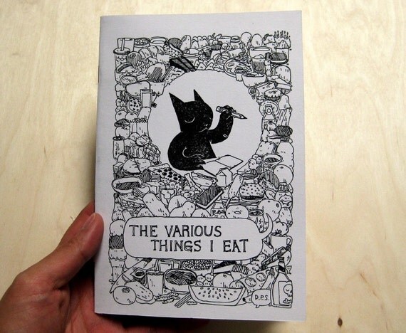
She asks people to contribute to the fanzine. For example, the contributors have ranged from writers/illustrators with passion or obsession, ranging from Fingland's buses to public transport in  to murals and mosaics to weather, all in Manchester. Similarly, the cover of each issue is designed by a different artist or illustrator each time. Bradbury sets no brief except the cover must feature the name of the zine. 


Manchester blog the shrieking violet collage

Collaborations.
 She has collaborated with Manchester's Modernist Heroines writing her feminist response to women. she has also collaborated in Sounds of the City which is a festival that celebrates new music and performance, uniting the cream of the national and international scene with some of the city’s finest independent promotors, collectives and club nights.


Production.
Bradbury then showed us good and bad designs and what we need to take into consideration when creating our zine. For example, is it legible on the background/font/colours chosen. It seems, she learned through mistakes with a few of her earlier zines quite difficult to read.

The Shrieking Violet is still roughly photocopied and hand-folded, which is very time consuming, but it can also be viewed online at Issuu for free or downloaded as a PDF. The current zine is 24 pages long but started off as only 16!

Distribution.
As well as distributing her zine to cafes, libraries and other public places she takes advantage of social media and online publishing sites. For example she uses Wemakezines, a community for zine culture and zines to be read online via Issu. She also has a blog to keep people up to date under the same name.

Lastly, this has allowed her to be feature in other publications and be interviewed. For example by David Haslan, Karen Glaze and 'The "F" Word - a feminist publication. This has helped in creating the annual Victoria Baths Fanzine Convention. She first started this in 2011 and has been so popular she continues now. This years is on the 5th May, 12pm - 4pm at Victoria Baths.


Tuesday, 16 April 2013

Progress Meeting : 16-04

Today we had our first proper progress meeting in which we relayed our condensed mind map with out 5 rules. (I'd insert an image of our mind map but we didn't get it back!) However, I was left wondering, at the end of the session, how beneficial this had been for us as a group.

Although it was good to hear other people's ideas and their approaches because that allowed us to see the different methods of creating zines and other areas we might have forgotten about otherwise.

However, the actual feedback we received from the tutors just seemed to be a misunderstanding of our intentions. As mentioned before, we found it difficult to understand zines as many of them we saw in the beginning were illustration and graphic based. We are very used to words, essays and debates we couldn't make sense of zines. We understand the content of zines can be whatever you choose and the same for the format yet we decided to follow a more visual approach in order to challenge ourselves beyond our comfort zone. When we originally discussed this the previous week, the tutors were excited that we were not going to restrict ourselves by our comfort zone.

 Therefore, we worked on a concept that would be visual yet work in our favour. So, we came up with an idea using images related to our exhibition proposals, from the previous unit,  and format it visually in our zine in a surrealist and Dadist manner.  Yet, when we explained this this week, we were told to stick to what we know and use words. We felt despite all the research we had done and the fact we had decided to come our of our comfort zones was all going to waste and was not appreciated. We left the session very confused - not a useful way to come out of a progress meeting.

Sunday, 14 April 2013

The Print Fair #1: 2022NQ


On Saturday, I attended the Print Fair at 2022NQ in The Northern Quarter. I'd never been to an event like this before so I didn't really know what to expect

It was a lot more intimate, and a lot smaller, than I thought it was going to be. I really enjoyed the fact that this event brought together a community of people and local artists. People chatted away with strangers and bonded over Kopperberg and the prints they bought. I may have got sucked in and bought a few things but I really enjoy the "handmade" and independent work. This was one of the things I enjoyed the most - there was no commercial aspect, yet there was a sort- of capitalist aspect in making money, but this was mostly to fund making more prints and further their work rather than making a profit.

This made me reflect upon the Zine fair and I think it'd be nice to create a community similar to the Print Fair. It's nice to see people interested in a less mainstream thing come together and enjoy the handmade and the lack of commercialism. As 2022NQ is one of the contenders for the Zine Fair, it was a good chance to see the space. Although small, it helped create the intimate atmosphere and a buzz of creativity.

A useful list of illustrators, artists, zinesters etc is available here.

Friday, 12 April 2013

Exhibizine : Mind Map

This was our initial mind map to show our thinkings. It follows the idea of the 'five rules' we needed to know/cover.

These 'five rules' are idea, content, format, audience and roles.

Idea: Using our hypothetical exhibition proposals from the Framings Unit to create the content for the zine. The zine will show visually our exhibition proposals. The four topics from the exhibitons are death row and memory, graffiti and wallpaper, wardrobes, clothes and identity/memory and maritime ceramics.

Content: Surrealists and Dadist inspired images of our proposals. For example, one person will work on a page then each one of us will work over the top in relation to our exhibition. For example, one page, we could end up with a man on death row being hung wearing a Karl Largerfield suit and glasses in a ceramic vase in a graffiti print.

Format: Similar to an exhibitor guide. Perhaps the outside is very minimal and boring. Then the inside is colourful and vivid. Perhaps a concertina, or some way of making the paper fold out different than simple a book format. A very punk-zine-esque look using glue sticks and scissors.

Audience: Those who are interested in contemporary art, those who frequent art galleries, those interested in zines

Roles: We have discussed that everything will done together as a team. The zine would not work if it was soley one person designing it as it wouldn't be a collaboration of our exhibition proposals.

Sunday, 7 April 2013

Neal Fox // Le Gun

Neal Fox is a London based artist/illustrator. He studied at Camberwell Art College and the Royal College of Art. Since graduating with an MA in 2005 his commercial illustration clients have included the Guardian, the Independent, the Times, Dazed and Confused, Faber & Faber, Absolut Vodka, Babyshambles and Red Hot Chilli Peppers.
Babyshambles comission

Absolut Commission
Faber & Faber Commission

Dazed and Confused Commission

The Independent Commission
The Guardian Commission
Le Gun is a self-titled annual independent publication created by Fox and other RCA graduates. The publication blends a punk, occult, pop and surrealist  aesthetic which makes Le Gun so distinctive.
Fox's more personal works are a cauldron of contemporary culture, with references from music and films. From a life long obsession with the tales of his inspiration, his dead grandfather, his large scale ink drawings have developed into increasingly layered celebrations of the debauched and iconoclastic characters.
 Fox creates a psychedelic nexus of events and trails of thoughts including Francis Bacon and William Burroughs taking tea in the ancient Egyptian after life, or Captain Beefheart selling a vacuum cleaner to Aldous Huxley at the Doors of Perception. Many of Fox's illustrations are spattered with blood, violence and surrealist fantasy (often in relation to drug use). However, I did notice the way in which Fox creates females within the illustrations. They were often debauched and represented as prostitutes or as sexual objects.


Much of his work openly represents his opinion on often provocative subjects such as sexuality, politics, gender and capitalism.